Thinking about repainting your living room but unsure which color to choose? Finding the right shade can take more thought than you might expect. You want a room that looks beautiful, feels comfortable, and suits the way you and your family spend time together.
There are no absolute rules about which paint colors belong in a living room. A bold shade that works beautifully in one home may feel overwhelming in another. Room size, natural light, furniture, flooring, and personal taste all influence how a color looks once it covers the walls.
Before starting your next painting project, take a moment to consider how you use the space and the atmosphere you want to create. Some colors can be harder to live with when used across an entire room, even if they look appealing on a small paint sample.
Disclosure: This article may contain affiliate links. Please refer to the relevant disclosure page for more information.
What to Consider Before Choosing a Living Room Paint Color
Your living room is often one of the busiest spaces in your home. It might be where you relax after work, watch movies with your family, entertain guests, read a book, or enjoy a quiet afternoon. Since the room serves so many purposes, its color scheme should work with your everyday routine.
Start by thinking about how you want the room to feel. Would you prefer a cozy space with warm, welcoming tones, or a light and airy room that feels calm and open? Your answer can help narrow down your paint choices.
Warm Colors vs. Cool Colors
Warm paint colors include shades of red, pink, orange, and yellow, along with neutral colors that have similar undertones. These shades can make a room feel cozy, lively, and inviting. However, very saturated warm colors may become overpowering when used on every wall.
Cool colors include blue, green, and purple, as well as neutrals with cool undertones. Depending on the shade and lighting, they can create a fresh, relaxed atmosphere and make a room feel visually open. Very cool colors, however, may feel a little stark in rooms with limited natural light.
Neither palette is automatically better than the other. The goal is to find a color that complements your space and creates the mood you want.
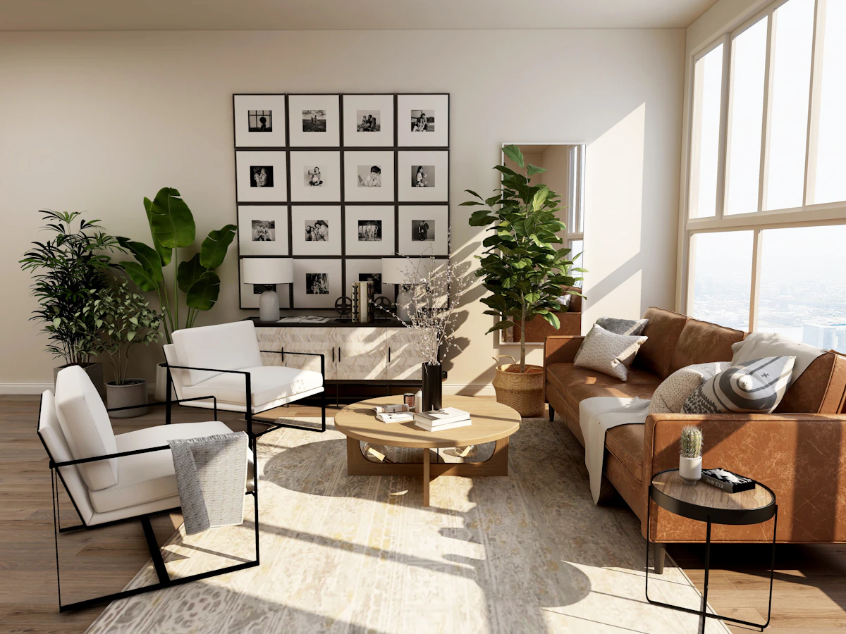 Image inspiration: Browse neutral living room interiors on Unsplash.
If you need more guidance, read this helpful resource on how to choose paint colors for your home's interior.
Living Room Paint Colors to Think Twice About
Some colors can be challenging to use across large wall surfaces. That doesn't mean you must avoid them completely. In many cases, the key is choosing the right shade, limiting how much of it you use, and pairing it with complementary colors.
1. Bright Orange Paint
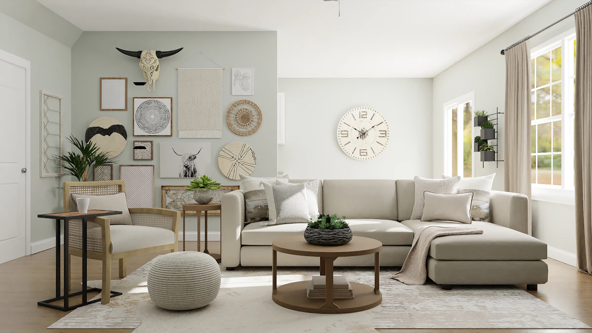 Image inspiration: Explore orange interior design ideas on Unsplash.
Orange is cheerful, energetic, and full of personality. It can add warmth to a home, but a bright or highly saturated orange may feel intense when used across all the walls in a living room.
Because orange naturally attracts attention, it can compete with your furniture, artwork, and other decorative details. What initially feels fun and vibrant may become tiring if the color dominates the entire space.
That doesn't mean you have to leave orange out of your design. A few orange cushions, a patterned rug, a piece of artwork, or a decorative vase can bring the same lively energy in a more balanced way.
If you love the idea of orange walls, consider softer shades such as muted terracotta, peach, or a dusty apricot. These colors offer warmth without the intensity of a vivid orange.
Better alternatives: Muted terracotta, soft peach, warm beige, or creamy white paired with orange accessories.
How to Make Your Living Room Paint Color Work
Before ruling out a color completely, consider how it will interact with the rest of the room. A shade that seems too strong on its own may work beautifully when balanced with the right materials and furnishings.
Pay Attention to Natural Light
Light can dramatically change the way paint looks. A warm shade may appear brighter in a sunlit room, while a cool shade can seem more subdued in a space with less daylight. Check your paint samples at different times of day before making a final decision.
Coordinate With Your Furniture
Look at your sofa, flooring, curtains, rugs, and wooden furniture before choosing a wall color. If these items are staying, select a shade that complements their undertones rather than competing with them.
Use Bold Colors as Accents
If you enjoy vivid colors, you don't necessarily need to cover every wall with them. Accent pillows, artwork, lamps, and smaller decorative pieces can introduce color without overwhelming the room.
Test Paint Samples First
Paint a small area on the wall or use sample boards to compare a few shades. Look at them under natural daylight and your usual evening lighting. This simple step can help you avoid choosing a color that looks very different once it covers a larger area.
 Image inspiration: Browse interior painting inspiration on Unsplash.
Living Room Paint Colors That Are Easier to Live With
If you're looking for a versatile color scheme, start with shades that complement your existing décor and create the mood you want. These options are worth considering:
- Warm beige: A comfortable neutral that pairs well with wood, cream fabrics, and natural textures.
- Soft greige: A blend of gray and beige that offers a balanced, understated look.
- Sage green: A muted shade that works beautifully with plants, wood furniture, and earthy accessories.
- Creamy white: A softer alternative to stark white that can help a room feel bright without looking too cold.
- Muted terracotta: An earthy color that adds warmth and personality without the intensity of bright orange.
- Light taupe: A flexible neutral that suits a range of traditional and contemporary interiors.
Remember that no single color is perfect for every home. The best choice depends on your lighting, room layout, existing finishes, and personal preferences.
Final Thoughts
Choosing a living room paint color doesn't have to be stressful. Start by considering how you use the room, decide what kind of atmosphere you want, and look at how different shades work with your existing furniture and lighting.
Bright orange is one color worth approaching carefully when painting a large area. While it can look cheerful and stylish in the right setting, a softer shade or a few well-placed accents may be easier to live with over time.
Above all, don't choose a paint color simply because it's trending or avoid one just because someone else dislikes it. Test your options in your own space and choose the shade that makes your living room feel like home.