The living room is one of the most-used spaces in any home. It's where families relax, guests gather, and everyday life happens. Because this room serves so many purposes, the wall color you choose can dramatically influence how the space feels.
While there are no strict rules about which paint colors belong in a living room, some shades can make the space feel overwhelming, dated, darker than expected, or surprisingly difficult to decorate around.
If you're planning a makeover this year, this guide covers 30 living room paint colors to avoid, explains why they can be challenging, and suggests softer alternatives that create a more inviting atmosphere.
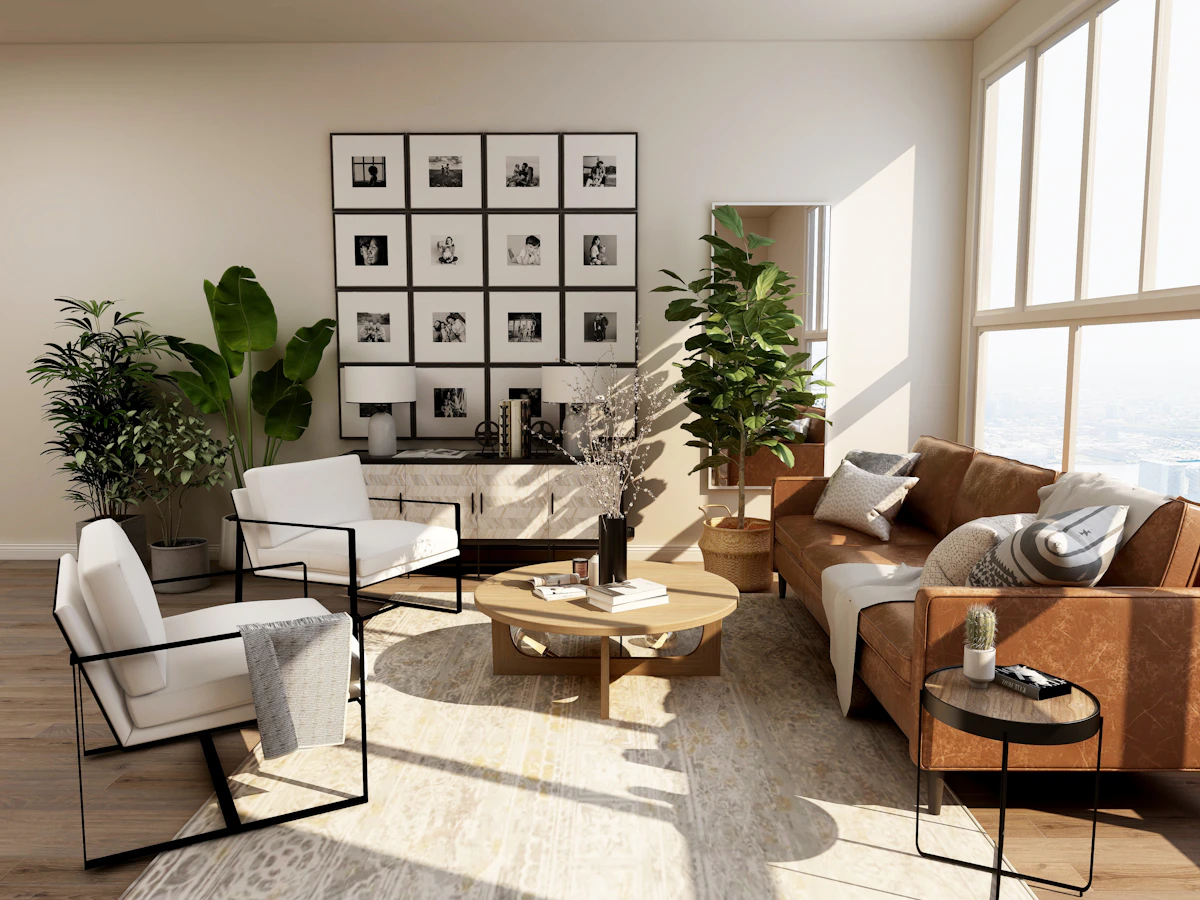 Image Source: https://unsplash.com/s/photos/neutral-living-room
How to Choose the Right Living Room Paint Color
Before looking at colors to avoid, think about how your living room is actually used. Is it where you entertain guests, watch movies, work from home, or simply unwind after a long day?
The answer helps determine whether warm or cool colors will work best for your space.
Warm Paint Colors
Warm colors include red, orange, yellow, pink, and neutrals with warm undertones. These shades can make a room feel cozy, energetic, and welcoming.
Cool Paint Colors
Cool colors include blue, green, purple, and cool-toned neutrals. They often create an airy, calming atmosphere and can make a room appear more spacious.
Once you understand the mood you want, it's easier to avoid colors that might become overwhelming over time.
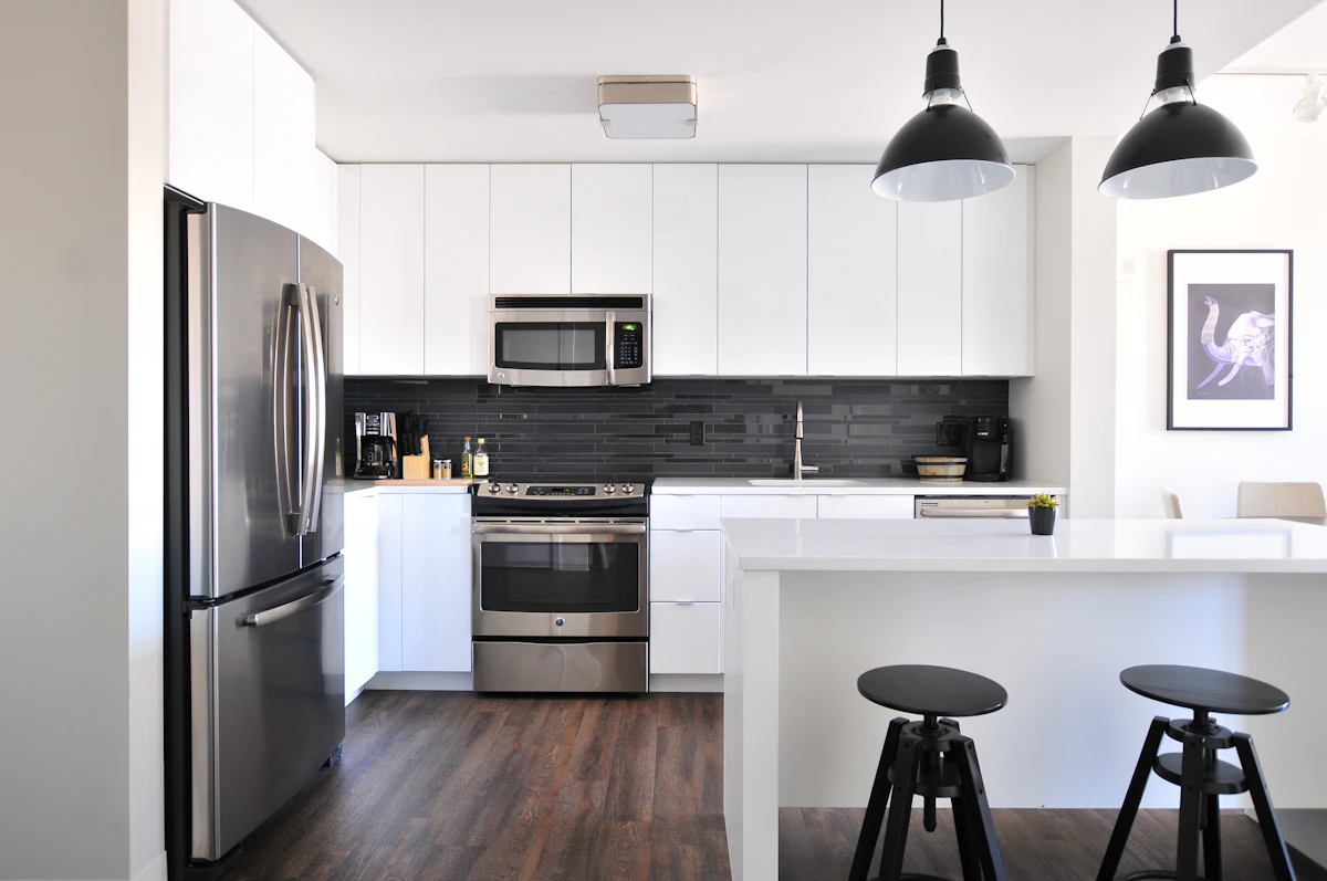 Image Source: https://unsplash.com/s/photos/interior-painting
30 Living Room Paint Colors to Avoid
1. Neon Green
Neon green instantly grabs attention—but that's exactly the problem. Covering an entire living room in this electric shade can quickly become visually exhausting.
Try instead: Sage Green or Olive Green.
2. Hot Pink
Hot pink can feel playful, but on large walls it often overwhelms furniture and décor.
Better option: Soft Blush.
3. Jet Black
Black absorbs light, making many living rooms feel smaller and heavier.
Alternative: Deep Charcoal.
4. Sunflower Yellow
Bright yellow reflects lots of light and can become tiring in sunny rooms.
Alternative: Butter Cream.
5. Electric Blue
Electric blue creates energy rather than comfort.
Alternative: Soft Sky Blue.
6. Lemon Lime
This citrus-inspired color often feels chaotic on large walls.
Alternative: Pale Pistachio.
7. Fire Engine Red
Intense red dominates a room and can make relaxing more difficult.
Alternative: Terracotta.
8. Cobalt Blue
Cobalt blue is beautiful but can feel heavy when used everywhere.
Alternative: Powder Blue.
9. Pastel Pink
Too much pastel pink can make a living room resemble a nursery.
Alternative: Dusty Rose.
10. Olive Green (Dark Version)
Very dark olive can absorb light and make rooms feel dated.
Alternative: Sage Green.
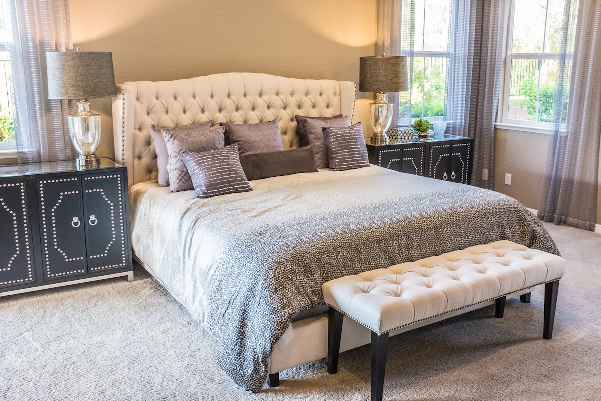 Image Source: https://unsplash.com/s/photos/green-living-room
11. Peach Fuzz
Soft peach can wash out a room if used excessively.
Alternative: Warm Beige.
12. Magenta
Magenta is better as an accent than a full-room color.
Alternative: Dusty Berry.
13. Ash Gray
Cold ash gray often feels sterile.
Alternative: Greige.
14. Chartreuse
This yellow-green shade can clash with many furniture styles.
Alternative: Soft Moss.
15. Burnt Orange
Burnt orange may feel dated if it dominates every wall.
Alternative: Clay Beige.
16. Bubblegum Blue
This playful color often feels more suitable for children's rooms.
Alternative: Soft Aqua.
17. Coral Crush
Coral works beautifully in accessories but can overwhelm walls.
Alternative: Muted Coral.
18. Mustard Yellow
Mustard can make a room feel heavy when overused.
Alternative: Warm Gold.
19. Mint Green
Mint sometimes lacks enough depth for a sophisticated living room.
Alternative: Eucalyptus.
20. Plum
Plum creates drama but may darken the space.
Alternative: Mauve.
Image Source: https://unsplash.com/s/photos/cozy-living-room
21. Burgundy
Burgundy can make a room feel overly formal.
Alternative: Warm Wine Accent.
22. Slate Gray
Deep slate often feels cold without warm textures.
Alternative: Mushroom Gray.
23. Icicle Blue
This icy shade can make a room feel chilly.
Alternative: Soft Blue-Gray.
24. Moss Green
Dark moss green can make a room feel older than intended.
Alternative: Olive Sage.
25. Eggplant Purple
Rich purple quickly dominates a room.
Alternative: Dusty Lavender.
26. Crimson Red
Crimson brings intensity that may become overwhelming.
Alternative: Clay Red.
27. Seafoam Green
Seafoam sometimes feels overly themed.
Alternative: Soft Coastal Green.
28. Terracotta (Dark Version)
Very dark terracotta can make smaller rooms feel enclosed.
Alternative: Light Clay.
29. Royal Purple
Royal purple feels dramatic but often limits decorating flexibility.
Alternative: Muted Violet.
30. Fuchsia
Fuchsia works best in artwork and accessories rather than entire walls.
Alternative: Rose Pink.
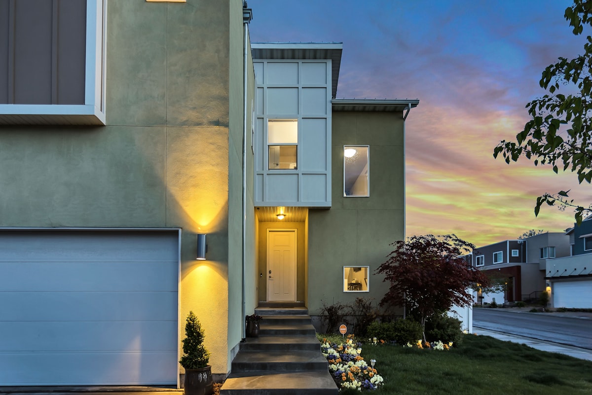 Image Source: https://unsplash.com/s/photos/earth-tone-living-room
Better Living Room Paint Colors That Stay Timeless
If you're looking for colors that are easier to decorate with and less likely to feel dated, these shades are consistently versatile:
- Warm Beige
- Soft Greige
- Sage Green
- Creamy White
- Light Taupe
- Muted Olive
- Clay Beige
- Dusty Blue
These colors work well with wood furniture, natural textures, modern interiors, and traditional décor alike.
Tips Before You Paint
- Test paint samples on multiple walls.
- Check the color in morning, afternoon, and evening light.
- Coordinate the wall color with flooring and furniture.
- Use bold colors as accents instead of covering every wall.
- Choose the right finish—matte, eggshell, or satin—for your lifestyle.
Final Thoughts
Paint color has a bigger impact on your living room than many homeowners expect. While personal preference should always come first, avoiding colors that are overly bright, excessively dark, or difficult to coordinate can save you from an expensive repaint later.
If you love bold colors like neon green, crimson, or hot pink, consider introducing them through pillows, artwork, rugs, or decorative accessories instead of covering the entire room.
A timeless living room doesn't have to be boring. Soft neutrals, warm earth tones, and muted greens create a comfortable backdrop that allows your furniture and personal style to shine for years to come.