Your living room should feel like a place where you can relax, spend time with family, and welcome guests comfortably. While furniture and accessories help shape the room, wall color often sets the tone for the entire space. The right shade can make a room feel brighter, warmer, and more inviting, while the wrong one may leave it feeling dark, cold, or visually overwhelming.
Choosing paint is not always as simple as picking a color you like. A shade that looks beautiful on a small paint sample may appear completely different when it covers an entire wall. Natural light, artificial lighting, room size, flooring, and furniture can all affect the final result.
If you're planning to update your living room in 2026, it may be worth reconsidering a few paint choices that can be difficult to live with over time. This doesn't mean these colors are always wrong. In the right room, almost any shade can work. However, some colors require more careful planning to keep a living space comfortable and balanced.
Here are six living room paint colors to think twice about before starting your next home makeover, along with practical alternatives that can help you create a timeless look.
1. Neon Colors That Feel Too Intense
 Image inspiration: Explore a green and gray wall photo on Unsplash.
Bright lime green, fluorescent pink, and electric orange can bring plenty of personality to a space. The challenge comes when these intense colors cover every wall in a living room.
Unlike a small decorative accent, a neon wall color is difficult to ignore. It can compete with furniture, artwork, and other details, making the room feel busy rather than relaxing. If you enjoy bold colors, using them across a large surface may also limit your options when you decide to change your décor.
That doesn't mean you have to give up vibrant colors altogether. A neon cushion, colorful artwork, a statement lamp, or a small decorative accessory can add energy without taking over the room.
What to choose instead: Consider muted sage, soft olive, dusty coral, or a warm neutral. These shades add character while remaining easier to coordinate with different furniture styles.
2. Very Dark Brown That Makes a Room Feel Heavy
 Image inspiration: View a moody interior-inspired photo on Pexels.
Brown can make a living room feel grounded, natural, and welcoming. The problem is that very dark chocolate brown, especially when used on every wall, can make a room feel visually heavy.
This effect may be more noticeable in a small living room or one that receives little natural light. Dark walls absorb more light than pale walls, so the space can appear less bright. The result depends on the room's lighting, layout, and finishes, but an all-over dark brown scheme can be challenging to balance.
If you love rich brown tones, you don't necessarily need to avoid them. Consider using dark brown on one feature wall, through wooden furniture, or in accessories. Pairing it with lighter upholstery, warm lighting, and reflective surfaces can help maintain a sense of balance.
What to choose instead: Warm beige, mushroom, light taupe, or soft greige can deliver a similar earthy feeling without making the room look as dark. These colors also work well with wood, linen, leather, and natural textures.
3. Cold Gray That Makes the Room Feel Unwelcoming
Image inspiration: Explore gray wall textures on Unsplash.
Gray has been a popular interior color for years, and it still has a place in contemporary homes. However, certain cool grays with strong blue undertones can make a living room feel less cozy than expected.
In a room with limited sunlight, an icy gray may appear flat or slightly stark. When combined with cool white lighting, gray flooring, and minimal decoration, the overall effect can feel more like an office than a comfortable place to unwind.
The solution isn't to avoid gray entirely. A warmer gray with subtle beige or brown undertones can create a softer look while preserving the clean, understated style that makes gray appealing.
Before committing to a shade, test it on the wall and observe it in the morning, afternoon, and evening. The same paint can look noticeably different as the light changes.
What to choose instead: Warm greige, soft stone, mushroom gray, or a gentle taupe. Pair these shades with wood furniture, textured fabrics, and warm-white lighting for a more inviting atmosphere.
4. Strong Red That Competes With Everything Else
 Image inspiration: View a red paint image on Pexels.
Red can bring warmth, drama, and personality to an interior. But when a highly saturated red covers every wall, it can become the main thing you notice in the room.
Bright cherry red and intense crimson may compete with artwork, furniture, and decorative accessories. If the rest of the room also features bold patterns or strong colors, the overall design can feel crowded.
For homeowners who love red, a more restrained approach can be just as expressive. Try adding red through cushions, a rug, artwork, or a statement chair. If you prefer painted walls, consider softer shades that work with the rest of your palette.
What to choose instead: Muted terracotta, dusty brick, warm clay, or a subtle rust shade. These earthy colors bring warmth without the intensity of a bright red wall.
5. Trend-Driven Green That May Be Hard to Coordinate
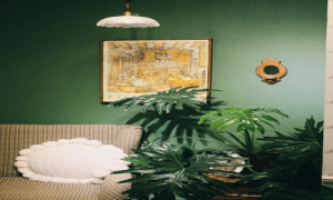 Image inspiration: See a green living room with plants on Pexels.
Green remains a natural choice for living rooms because it connects easily with plants, wood, and other organic materials. Still, not every shade of green will suit every home.
Highly saturated greens or unusual shades chosen mainly because they are fashionable can be harder to coordinate with existing furniture. A color that looks exciting in a design photograph might feel very different in your own home, especially when the lighting and surrounding finishes are different.
Rather than choosing a shade simply because it's popular, think about how it will work with your flooring, sofa, curtains, and artwork. A well-chosen green can remain appealing for years when it complements the rest of the room.
Muted, nature-inspired greens are often easier to use than extremely bright versions. They can add depth while allowing furniture and decorative details to stand out.
What to choose instead: Sage green, soft olive, subdued eucalyptus, or a muted moss shade. If you're unsure, test a few samples before painting the entire room.
6. Stark White That Looks Too Harsh
Image inspiration: Explore a clean white-wall interior on Pexels.
White is a classic living room color for good reason. It can make a space feel fresh, simple, and open. However, a very stark white may look harsh in certain rooms, particularly when paired with cool lighting and other high-contrast finishes.
In a room with strong sunlight, bright white walls can also create glare. In a dim room, the same paint may look flat or grayish rather than crisp and clean. The result depends on the specific paint formula, the direction of the windows, and the surrounding colors.
If you love white walls, you don't need to abandon them. Instead, compare different white paint samples in your own space. Some have subtle yellow, red, or beige undertones that create a softer appearance, while others lean cooler.
What to choose instead: Creamy white, warm ivory, soft linen, or a gentle off-white. These shades can maintain a bright appearance while adding a little more warmth to the room.
Living Room Paint Colors Worth Considering Instead
If you're not sure which direction to take, start with colors that complement your home's existing features. A versatile palette doesn't have to be boring. Subtle variations in undertone can make a room feel considered, comfortable, and personal.
- Warm beige: A flexible option that pairs well with wood, cream fabrics, and many furniture styles.
- Warm greige: A blend of gray and beige that offers a neutral look without feeling too cold.
- Sage green: A muted green that works especially well with natural materials and simple décor.
- Creamy white: A softer alternative to stark white for a bright, welcoming interior.
- Muted terracotta: An earthy option for adding warmth and character without using an overly intense red.
- Soft taupe: A balanced neutral that can complement both contemporary and traditional spaces.
These are useful starting points, not universal rules. The best paint color is one that works with your lighting, architecture, furnishings, and personal taste.
How to Choose the Right Living Room Paint Color
Consider the Natural Light
Notice how much daylight enters your living room and which direction the windows face. A color that looks warm in one room may appear cooler in another. Test samples at different times of day before making a final decision.
Work With Your Existing Furniture
Unless you're planning to replace everything, use your sofa, flooring, curtains, and major furniture pieces as a starting point. Choose wall colors that complement those items rather than competing with them.
Test Paint Before Committing
Paint sample patches on more than one wall, or use large sample boards that can be moved around the room. Observe the samples under both natural and artificial light. This small step can help you avoid an expensive repaint.
Think About the Mood You Want
Ask yourself how you want the room to feel. Soft neutrals can create a quiet backdrop, earthy shades can add warmth, and deeper colors can bring drama. Choose a color based on the atmosphere you want rather than following a trend automatically.
Don't Forget the Finish
Paint finish also affects the final appearance. Matte and eggshell finishes tend to have a softer look, while higher-sheen finishes reflect more light and may highlight surface imperfections. Check the paint manufacturer's recommendations for the room and wall condition.
Final Thoughts
Choosing a living room paint color is about more than following the latest design trend. It is about finding a shade that feels right in your home and works with the light, furniture, and details you already have.
Neon colors, very dark browns, cold grays, intense reds, difficult-to-coordinate greens, and stark whites can all present challenges in certain spaces. However, none of these colors is automatically wrong. The key is understanding how the shade will look across a full room and how it will work with everything around it.
Warm neutrals, muted greens, creamy whites, and earthy tones are useful alternatives if you're looking for a versatile starting point. Take your time, test paint samples, and look at them under different lighting conditions before making a decision.
If you're planning a larger refresh, working with an experienced painting professional can help you prepare the walls, compare suitable finishes, and achieve an even result. For interior and exterior painting services, visit Fish Painting LLC to learn more about available services.
With a little planning, you can choose a living room color that feels welcoming today and continues to suit your home for years to come.